Getting the Clicks!Adages don’t become old unless they have more than a modicum of honest to goodness, time-tested truth at their core. The old adage that you never get a second chance to make a first impression is no exception and it’sespecially true in business. The best offerings, the best pricing, the best presentations can all be undone by a disastrous or even lackluster first impression. With all of the potential points of contact that your business has, it’s both a challenge and a priority to make certain they are each having a positive effect on the new potential customer. Those new, potential targets are everywhere – reading magazines and newspapers, driving in cars, watching television, surfing the web… Your goal should be to make your brand’s flawless first impression ubiquitous.
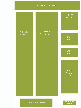
You worked hard on your website so why not work just as hard on the vehicles that are going to bring people to it? Banner advertising’s main purpose is to move more traffic into specific areas of your website but it can also make a great first impression. Let’s start with the idea that a banner is often a first point of contact as one of a quintet of helpful tips that will help you and your company build better banners.
1. A+ APPEARANCE:By now you’ll agree, the majority of people are going to get their first impressions of your website based on a banner ad pointing them to it. To be certain that it presents you in the best possible light make sure it’s in your corporate standard and features compelling, professional design. You should be extra careful that all of your spelling and grammar are absolutely correct as a mistake here could be an instant turn off. Also, select font sizes, styles and colors that maximize your ad’s readability. If your banner ad is of poor quality, people will assume your website is too.
2. KEEP IT SIMPLE:Most banner ads only have a few seconds to make a powerful impact on the viewers. All of the ads in your banner ad campaign must be able to convey your message quickly! When you keep the concept simple and wording clear and concise, you increase the likelihood that the viewer will “get the message”. If the viewer can’t easily and quickly understand what your banner ad is saying, it is unlikely she will click on it. Use the fewestwords you can. As in all advertising – just because you can fit more words in your ad doesn’t mean you should. Once someone clicks to your website, you’ll have ample opportunity to provide more details.
3. EMOTIONAL LANGUAGE:Words like “free”, “special offer” and “secrets” help attract a web surfer’s attention and very quickly increase her curiosity in your offer. Similarly when you target that emotion with words that create an emotional response in your industry, your category and about your product and service your clicks will increase. It’s also important to be unique and original as you position your company… even in banner ads.
4. BLAST BENEFITS:We’ve all agreed that we don’t have much time or much space to get our banner ad to accomplish it’s objectives. And, unless you are the only company on the planet offering your products and/or services then you have competitors selling the same. Because of those two facts, it is much more effect to briefly explain how your offering is going to benefit the potential clicker. This also helps you continually position your brand and create real difference between you and your competitors while giving users a reason to click through to your site.
5. CREATE ACTION:Quite likely the first and only thing you want the eyes that see your banner ad to do is to simply click on it to visit your site, so why not come right out and demand it? Your audience isn’t dumb but it never hurts to hit the masses over the head with an idea – when someone says “Smile” people usually do. It’s basic psychology but almost all banner ads prominently feature the call to action “Click Now”. If the design and message are slightly compelling that command, like “Smile”, can trigger significantly more clicks than if it were left off..

