Royal Bank America
At time of republishing this past project post, Royal Bank America was recently acquired by Bryn Mawr Trust.

Royal Bank America had just changed their name and focus to underscore growth objectives and celebrate 50 years of community banking—two pillars that created a perfect climate for re-branding. VFC created a strategy for a new corporate identity and bank brand that told a story of a community bank that treats customers like royalty. A strong navy with a punch of orange professionally and competitively positions Royal Bank America as a competent partner with deep roots. With a literal reflection, the five points of the logo’s crown signify the collaboration between customers, shareholders, community and staff joining hands with RBA in a stylized crown glyph reflecting the name and the commitment to customer service. The bold, creative logo reflects the modern reinvention of the half-century-old Royal Bank America and is featured in the Graphis Logo/Letterhead 9 as a Silver Award Winner.
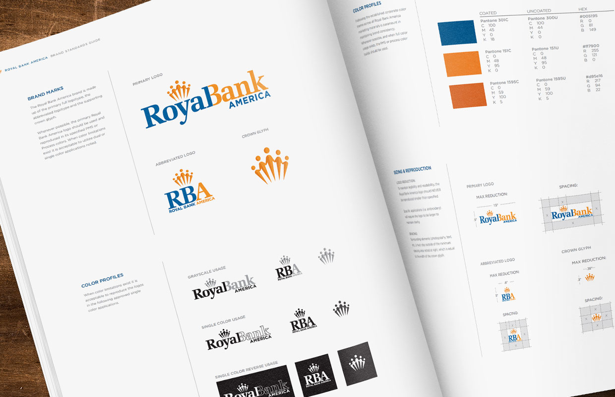
Every VFC identity package is supported by brand assets and standards. Assets are an organized digital archive of all brand files including multiple versions of logos, glyphs and taglines, while the brand standards define brand usage in a professionally organized style guide. The Royal Bank America brand standards are the catalyst for a style guide that redefined the fifty-year-old financial institution’s branding and successfully positioned them for acquisition.

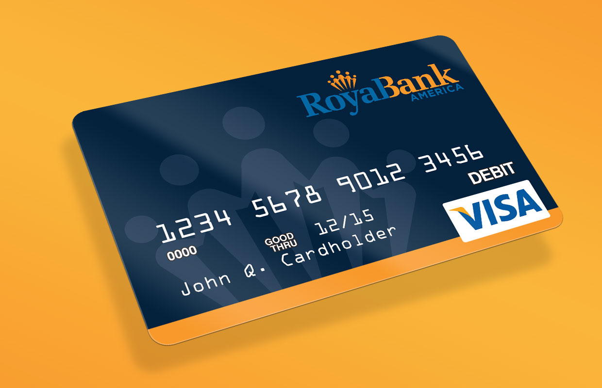
RBA moved fast with the launch of their new identity, and that meant modifying many branded elements. VFC reacted swiftly to support the bank’s transformation—quickly facilitating branding requests that included everything from golf balls, employee apparel, event banners to an impressive new debit card. Standards helped to define all design approaches, and the new RBA brand created big buzz for the revitalized community bank.
